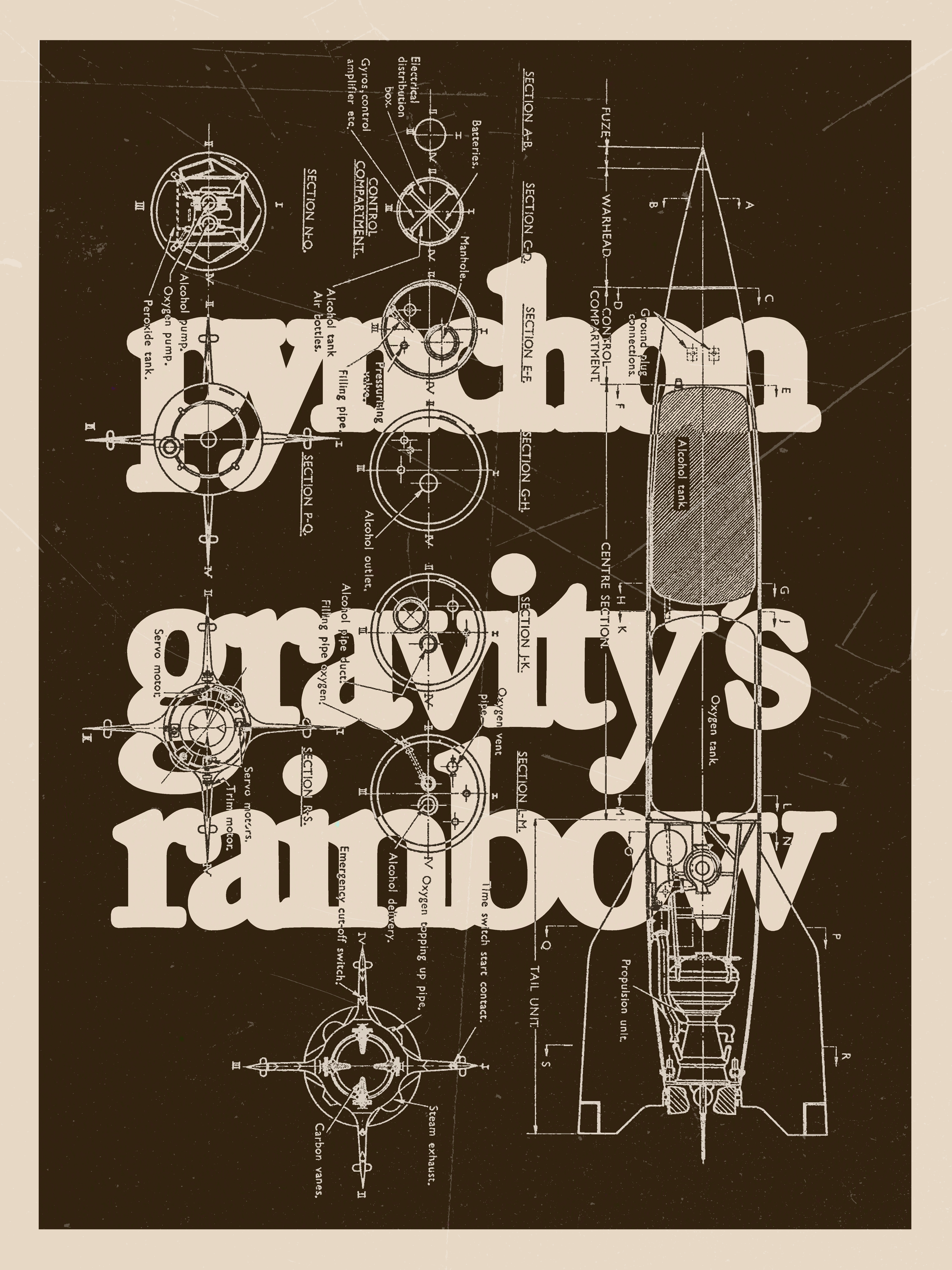
PRYCE BATEY
BEYOND THE ZERO
︎︎︎
DESIGN COLLLECTION N°1
A SMALL SELECTION OF DESIGNS FROM 2021-2023
CLICK ON AN IMAGE TO LEARN MORE ABOUT EACH PROJECT
A SMALL SELECTION OF DESIGNS FROM 2021-2023
CLICK ON AN IMAGE TO LEARN MORE ABOUT EACH PROJECT


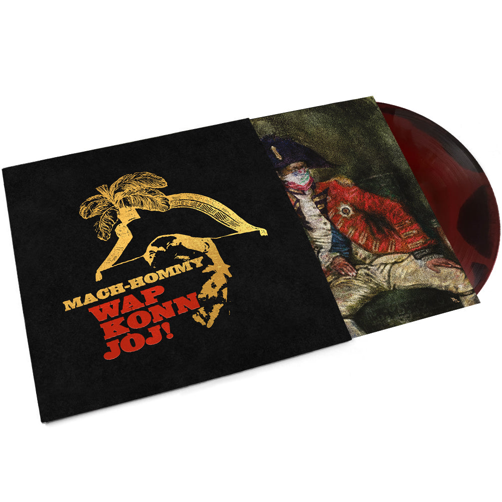
WAP KONN JÒJ!
The 5th Anniversary edition of Mach-Hommy’s Wap Konn Jòj! features a Deluxe felt-style jacket with new artwork illustrated by me. Foil stampted and limited to 187 copies, you can purchase a copy exclusivly at zotanica.com
Mach-Hommy is a Haitian-American rapper whose work often centers around Haitian history and identity.
His album entitled Wap Konn Jòj! deeply reflects the struggles surrounding independence, colonization, and revolution and for this design, I wanted to highlight this. I utilized elements from CL James novel about Toussaint Louverture and the Haitian
revolution, The Black Jacobins, to create a sense of historical significance and importance. The album cover itself shows Mach-Hommy dressed in traditional military garb and I wanted to keep this element in both of my designs, specifically the tricorne hat. Because I wanted to make this as a piece of album promotion, I looked to the history of gum or glue posters often seen plastered across city streets. This gives the designs intent and texture to allow for historic wear that is as bold as the Haitian flag that dons Mach-Hommy's face.
Mach-Hommy is one of hip-hop’s most fascinating recent success stories, adopting the unlikely art of rarity to disrupt the so-called rap game. Releasing his music directly to listeners and never revealing his face or identity, Mach has drawn widespread praise for crafting street poetry instilled with a sophisticated texture and palpable wisdom. Wap Konn Jòj! is another priceless solo collection from Haitian-American rapper, featuring apperances by Earl Sweatshirt, Tha God Fahim, Quelle Chris, and Your Old Droog, plus beats by Alchemist, Preservation, Trellion, and Navy Blue.


COVER ART


In one of my design courses at the University of Arizona, we were given a prompt to make a cover for a piece of media. I chose to make a DVD cover for one of my favorite films, Coonskin, by Ralph Bakshi. Coonskin is a movie that tackles America’s history with minstrelsy and blackface specifically in animation. This extremely subversive and satirical film understands and creates conversations about racist portrayals in media, specifically in the mid 20th century. With all of this in mind, I decided to repurpose a Minstrel era advertisement. Distorting the figure’s face and head allows for the perception of blackface and minstrelsy to, literally, be put on its head, which is something the film itself exemplifies. With such a large, glaring, and distorted depiction of blackface as the cover’s centerpiece, I chose to juxtapose it with a classic serif typeface. I wanted this design to subvert societal norms that often hide the disgusting history of blackface by forcing the viewer to look at it in its plentiful eyes.
Below are other examples from the same assignment.
![]()
![]()
![]()
Below are other examples from the same assignment.
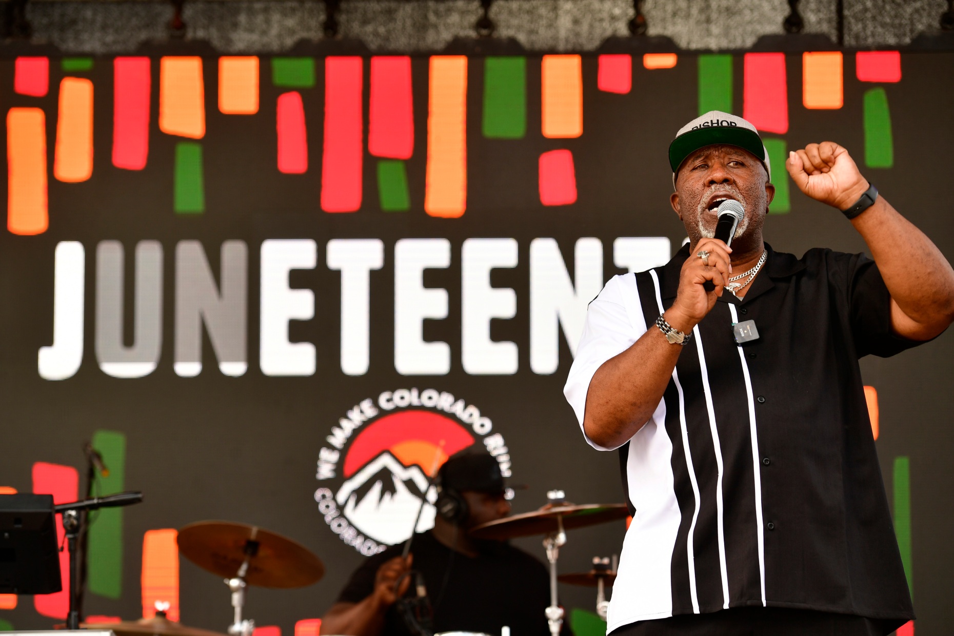
JUNETEENTH MUSIC FESTIVAL

Growing up in Denver, just blocks away from the historic five-points neighborhood, the Juneteenth festival has always been a part of my life. To me the celebration has always felt above reality — it is a festival that attracts more than 40,000 atendees that focuses soley on Black achivement, history, and freedom in a city whose Black population is under 10%. This year Juneteeth was recognized as an offical State holiday in part due to the efforts of Colorado Workers for Innovative and New Solutions (COWINS), a Union representing more than 31,000 State employees.
I was given the opportunity to create deisgns for Colorado WINS and the festival to commemorate the occasion. With this design I wanted to utilize iconography of the African diaspora while honoring Colorado WINS and the work they continue to do to uplift working class people in Colorado in a simple, shareable, and highly recogniziable way. At my core, all I want to do is make my younger self proud — having some 40,000 atendees see my deisign as legnedary Artists like Twista and Dave East celebrate Blackness at one of the country’s largest Juneteenth festivals in a neighborhood I grew up in does just that.
I was given the opportunity to create deisgns for Colorado WINS and the festival to commemorate the occasion. With this design I wanted to utilize iconography of the African diaspora while honoring Colorado WINS and the work they continue to do to uplift working class people in Colorado in a simple, shareable, and highly recogniziable way. At my core, all I want to do is make my younger self proud — having some 40,000 atendees see my deisign as legnedary Artists like Twista and Dave East celebrate Blackness at one of the country’s largest Juneteenth festivals in a neighborhood I grew up in does just that.


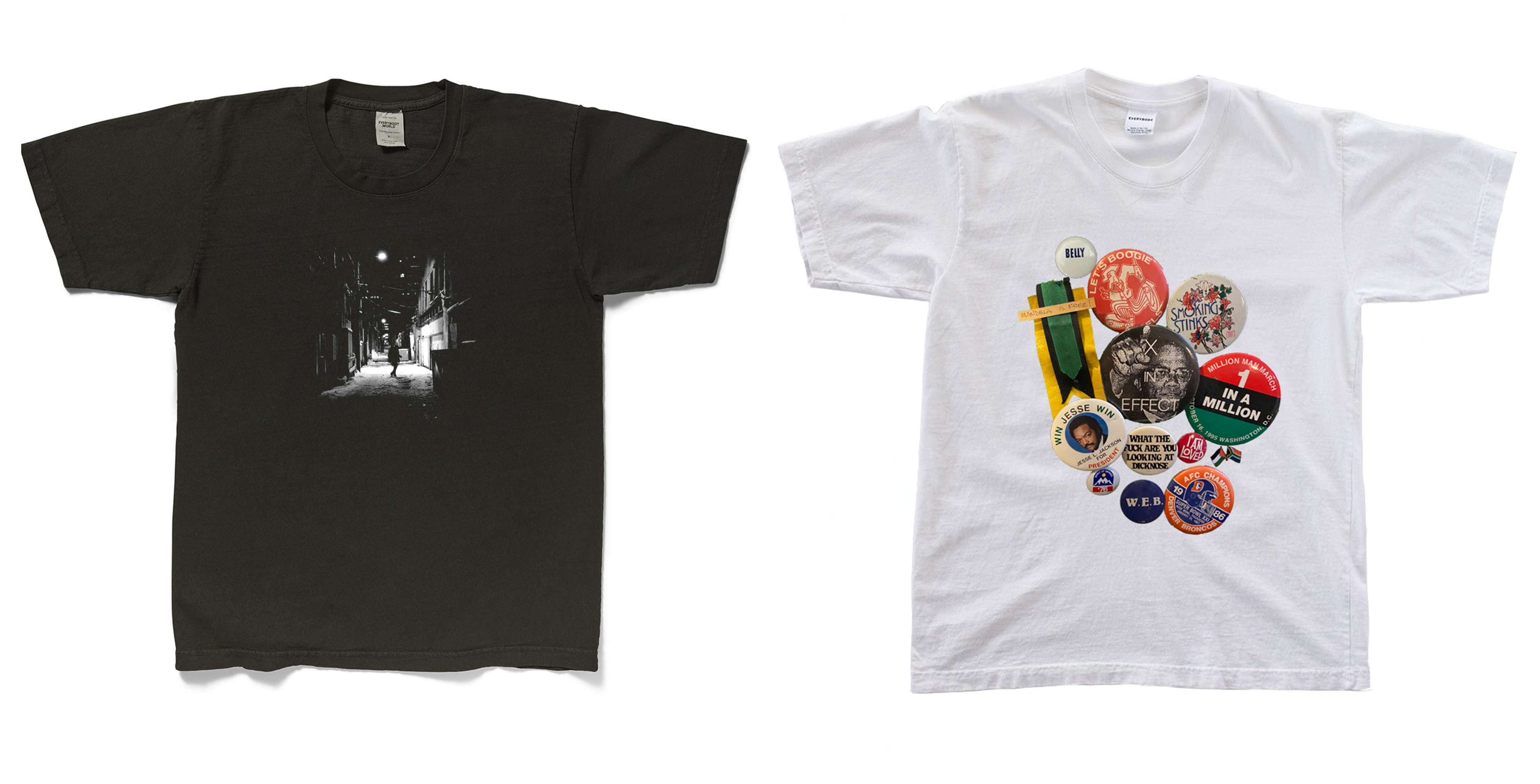
INKWELL BOOKS


Inkwell Books is a small online book reseller based out of Denver, Colorado that focuses on the African-American literary tradition. I worked with Inkwell to create their branding, merchandising, and other design choices. They allowed me much leniency in choices while making the designs because they were still in their infancy when I was working with them. I chose to use a bold serif typeface that resembles ink bleeding on paper for their primary logo. I also created various pieces of merchandise for the company that reflects their mission of serving the community and highlighting Black authors. The quote that surrounds the logo on some of the bags is from Toni Morrison, unpacking the importance of word choice in literary traditions and how violent rhetoric can and does limit knowledge and growth.


